1. Associative thinking
The first creative method is associative thinking. This is a method everyone uses more or less unconsciously when thinking. It’s a bit like brainstorming: you take a core thing as a starting point, associate the elements related to it, and extend outward in a radial way. Thinking by association sounds like a very simple method, but most of the time thoughts race around in the brain in a messy, disordered and illogical way, so we need some systematic methods to settle our thinking down and find a clear direction for our ideas. If you don’t know where to start, we can think from three directions: horizontal association, vertical association and relational association. Horizontal association means diverging around the core thing, only considering things directly related to the core thing, that is, things associated at one degree of separation.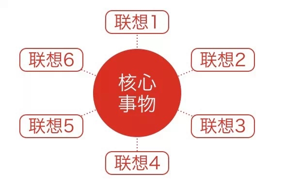
Horizontal association. For example, let’s do an exercise: name 10 things related to “wind”. You might think of “cold, winter, desert, seaside, leaves, kite, long hair, dust, silk scarf, air” and so on. These are all things directly related to “wind”. If horizontal association is drawing a circle around a point, then we can also make its radius bigger and do vertical association. Starting from the core thing, each associated thing must be related to the previous thing, digging deeper to find things associated with the core thing at two, three, even five or six degrees of separation.
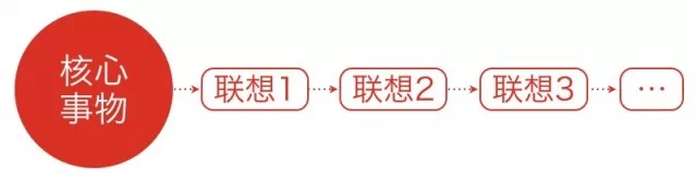
Vertical association. For example, still using “wind” as the theme for vertical association, we can think of “wind — kite — spring — willow — buds — catkins — seeds — life” and so on. In addition, we can also associate from the angle of relatedness, associating what two things have in common. This is very useful for designs with more than one theme. For example, name 10 things “wind” and “fire” have in common. We can think of wind and fire both being “formless, destructive, able to produce energy, untouchable, something you can feel, natural, able to be produced artificially, air, able to be big or small, hard to control”.
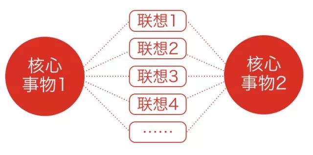
Relational association. Through association in these three directions, we can diverge creatively as much as we like.
2. Diverge and converge
The diverge-and-converge method is actually a way of thinking that can be applied anywhere. First diverge on your own, then screen the possibilities, and finally converge on a solid direction. By repeatedly alternating “diverging — proposing creative ideas” and “converging — analyzing and screening creative ideas”, you gradually reach the expected goal. For example, in design, we can first list all possible creative points, then analyze and screen out the feasible ideas, then diverge again and raise the problems that need to be solved in that idea, then converge again and focus on the best solution, alternating back and forth like this until the goal is finally reached. With this funnel-shaped way of thinking, the ideas that finally settle out have all been screened layer by layer.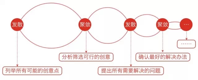
3. Mapping reality
When people talk about mapping reality, many think of skeuomorphic design. The original skeuomorphic design was meant to lower the user’s learning cost and guide correct operation. However, as people use electronic products more and more, their acceptance of virtual interfaces is getting higher and higher; without the guidance of skeuomorphism, users still know how to operate things. Some skeuomorphic interfaces overemphasize details, which also places a visual and cognitive burden on users. But drawing inspiration from the real world doesn’t mean you must 100% reproduce the real texture of the physical world. What you distill and abstract from reality can be form, color, texture, or movement patterns, optical and mechanical properties, and other parts that are most characteristic of an object. For example, the design style of Google Material Design was inspired by paper and ink. By simplifying complex visual elements like this, you can likewise design products that are both simple and able to stir users’ emotions.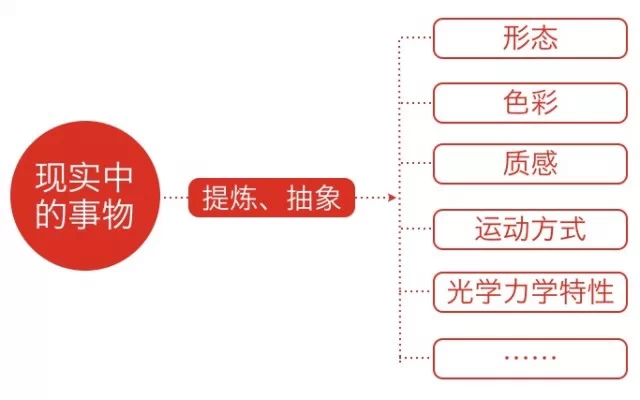
Mapping reality. Take the example below: the iOS 6 weather forecast interface has a strong texture, and the glass panel effect and the details of the weather icons completely simulate real things. Looking at it now, the visual style seems a bit outdated. The second image is the iOS 7 weather forecast, which removes the strong texture and the visual burden; we feel its information is presented more clearly and it emphasizes content more, which is a good design — but would you say it’s special or moving? Probably not. Now look at the interface of a third weather app, Haze. Haze reflects how temperature feels through changes in color; from 34° to 37° the color gradually deepens and becomes more vivid, and you feel hotter and hotter. The direction in which the background ripples float reflects the trend of temperature change, and the amplitude of the ripples shows whether the temperature difference is large or small — a big temperature difference makes it float quickly, a small one makes it float only slightly. Whether it’s color or the trend of change, these are in fact characteristics abstracted from reality, truthfully reproducing the way temperature feels, and a design like this makes people feel it is full of emotion and is moving. These are all inspirations reality gives us.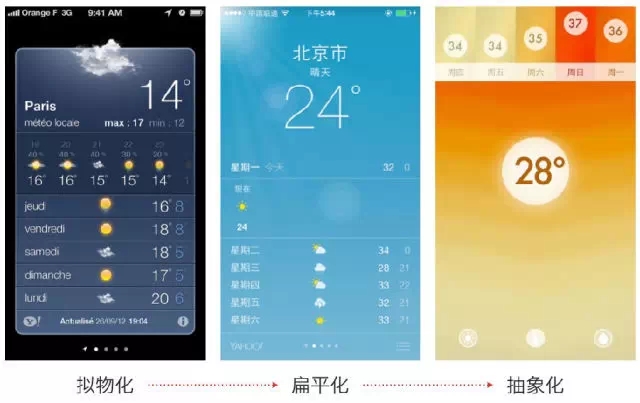
Three weather app designs. Now look at Paper’s interface: the card-style design looks flat, but it actually carries a metaphor, an operational hint that comes from real-world logic — we can touch, flip and rotate these “cards”, and the cards won’t disappear out of nowhere but move along with the user. What looks like a flat design is in fact also a kind of mapping and abstraction of the “real world”.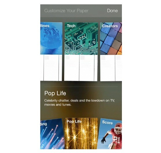
4. Combining elements
In nature, elements can be combined to form all kinds of new substances — for example, hydrogen and oxygen can become water. Combining different old elements in new ways can also produce new ideas. Combining elements is not simply stacking them either; it can be seen as a kind of creation built on top of what already exists.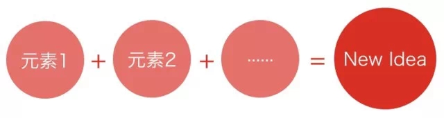
For example, a pencil with an eraser looks like nothing more than an ordinary thing now, but when an American painter invented that pencil, the patent sold for 550,000 US dollars and was regarded as a great creation — in fact it was just the result of stacking elements. The Walkman was rated one of the great music inventions of the past 50 years, and it too was the stacking of headphones + a recorder. As shown below, Flappy Bird and 2048 are two mini games with completely different controls, yet the game designer cleverly stacked the two together and it became a new hit mini game.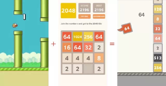
Next let’s look at two Durex marketing cases. A hit 2048 mini game, combined with Durex’s usage scenarios — single, chatting someone up, dating, falling in love, hugging, kissing and so on, until the final stage where Durex is used — became a highly shareable marketing case. Durex never tires of this trick: its “N times a night” mini game is old wine in a new bottle too, using the format of the hit game “Don’t Guess the Black Block”, which lets everyone play it right away, and the slightly risqué spoof copy makes people very happy to share it.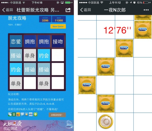
Two of Durex’s marketing mini games. From those two cases we can see that it’s really just a product’s core function fused with a classic or trendy mini game, and it becomes a New Idea. The product’s core function is Durex’s usage scenarios, plus 2048, Don’t Guess the Black Block, or widely spread mini games like Plane Shooting or Crazy Guess the Picture; and in the end, because it’s simple and easy to pick up and a bit of off-color fun, it becomes a highly spreadable marketing plan.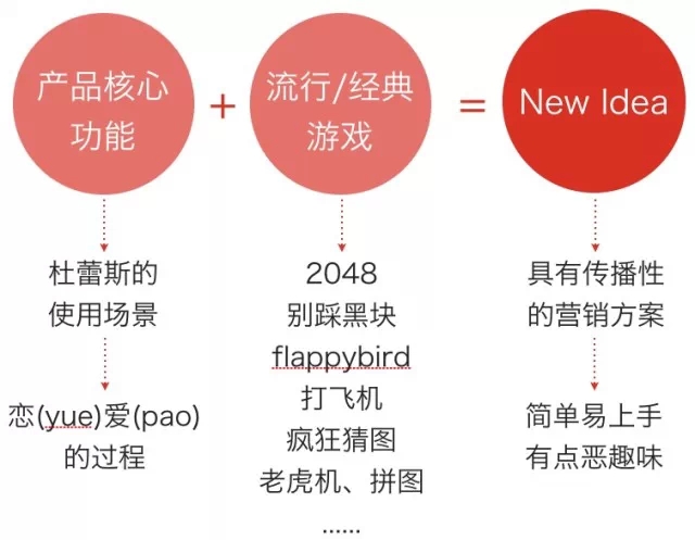
Author: @ME NetEase Mobile Design Source: UISDC