
I’ve been using CSS for quite a while, but I always used “px” to set the relevant properties of Web elements, and never dared to use “em”. The main reason was that I didn’t really understand it — I only knew a few conceptual bits. A while back a project required using “em” as the unit for setting elements, so I studied “em” from scratch. I now have a slight understanding of it, and today I’ve deliberately put together a blog post to share with everyone, hoping it helps you folks a little. This tutorial will guide you through using “em” to create a basic elastic layout, so you can learn how it is calculated, how “em” is used to scale layers elastically, and how to scale text, images and other content. So let’s start today’s “em” journey with these questions in mind.
What is an elastic layout?
The user’s text size and elastic layout The text size a user’s browser renders by default is “16px”; in other words, the text size of “body” on a Web page is rendered as “16px” by default in the user’s browser. Of course, if the user is willing, they can change this font size setting — the user can change the browser’s default font size through UI controls. One key point of elastic design is that all elements on the Web page use the “em” unit value. “em” is a relative size; we can set it like this: 1em, 0.5em, 1.5em, and so on, and “em” can even be specified to three decimal places, for example “1.365em”. And “relative” here means:
- A relative calculation must have a reference point, and “relative” here means relative to the element’s parent element’s font-size. For example: if the font size set on a is “16px”, then the descendant elements of thiswill inherit its font size, unless the font size is explicitly set again on the descendant elements. At that point, if you set the child element’s font size to “0.75em”, then the calculated font size is equivalent to “0.75 X 16px = 12px”;
- If the user changes the text size through the browser’s UI controls, then our whole page will also scale up (or down), so it won’t be the case that a change to the browser’s font makes the whole page fall apart (I think everyone has run into this — if you don’t believe me, try it on a project you’ve built yourself, and you’ll find it quite terrifying).
Everyone can take a look at this elastic layout example. Now if you use the browser’s UI controls to change the text size, or just press “ctrl +” and “ctrl -”, you’ll find that with this elastic layout example the browser scales up and down accordingly as the font size changes while browsing, without affecting the overall page layout. Note: all the HTML and CSS in this example will be used throughout this tutorial. As for other elastic layout examples, you can visit Dan Cederholm‘s Simplebites and change the text size while browsing. After trying it, don’t you think the elastic layout page is very flexible, and just as precise as “px”? So as long as we master the basic relationship between “font-size”, “px” and “em”, we can quickly use CSS to create precise layouts.
CSS’s Elastigirl introduces EM
Elastigirl‘s “em” is extremely powerful and flexible: no matter what the font size is — 12px, 16 or 60 — it can work out its value. em is actually a typographic unit of measurement, and there’s a little story behind its origin too; I won’t tell you that story, because you’re not here to listen to me tell stories — I think you’d rather know about the things it does in CSS. In CSS, “em” is actually a vertical measurement. One em equals the vertical space required by the letters in any font, and has nothing to do with the horizontal space it occupies. Therefore: if the font size is 16px, then 1em = 16px.
Getting started
Before we start to understand this “em” in CSS, we need to know its default font size in the browser. As it happens, we already did this above: in all modern browsers the default font size is “16px”. So the default setting in the browser will be: 1em = 16px Therefore, when a CSS selector is written, the browser already has a default font of “16px”. At this point the
in our Web page inherits this “font-size:16px;”, unless you explicitly set the “font-size” value of in your CSS styles to change the inherited value. In that way, “1em = 16px”, “0.5em = 8px”, “10em = 160px” and so on, and we can also use “em” to specify the size of any element.Setting the Body’s font-size
Many veterans have drawn a conclusion from years of practice: they suggest setting a font size on
suitable for body text, or setting it to “10px”, which is equivalent to (“0.625em or 62.5%”), so that its child elements are easier to calculate. Both are acceptable. But we all know that the default font of is “16px”, and it is also clear to us that if we change its default value, then to keep the elastic layout from being broken we need to recalculate and readjust. So the perfect setting is:body {font-size:1em;}But under that unloved IE, there is a problem with “em”. When you adjust the font size it will likewise break our elastic layout. Fortunately, there is a way to solve it:
html {font-size: 100%;}Formula conversion — PXtoEM
If you’re creating an elastic layout for the first time, it’s best to keep a calculator by your side, because at the beginning there will be no shortage of calculations — you’ll feel safer with one. Pixels are too close to us, so we’ll start here. First you need to work out the ratio between 1px and em, and then know the px value you need. From the introduction above, everyone knows that 1em is always equal to the parent element’s font size, so we can calculate it entirely with the formula below: 1 ÷ the parent element’s font-size × the pixel value to convert = em value Everyone can refer to the conversion table below (values when the body font is 16px)
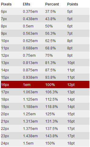 Next let’s look at a very simple example together, “Using CSS’s EM to create a 960px-wide elastic layout” HTML Markup
<body> <div id="container"> …</div> </body>Converting 960px to em 1 ÷ 16px × 960px = 60em The precondition for this calculated value is
‘s “font-size:16px”. CSS Codehtml { font-size: 100%; } body { font-size: 1em; } #container { width: 60em; }From the example above, I think you can picture it more vividly, because there is an example to consult. In fact we can rearrange the calculation formula above, which will make your calculations more convenient: the pixel value to convert ÷ the parent element’s font-size = em value Then our example above, “960px”, can be converted to an “em” value like this: 960px ÷ 16px = 60em Above we saw together how “px” is converted to “em”. Next let’s take a look at building the elastic layout example shown above. Below we’ll mainly implement it together step by step.
Building an elastic container
To create the centering effect of the elastic layout example, we first need to create an HTML structure. Here I’ll create a
and name it “wrap”<body> <div id="wrap"> content here</div> </body>We want this container to be “740px” wide, suited to an “800px × 600px” screen example. So how many “em” will “740px” equal? That’s the question we need to care about, so let’s look at it together: 1. Convert “740px” to “em” and set it on our container “div#wrap”: We all know that the parent element
of “div#wrap” has its font set to “16px”, so at this point, with no other explicit setting, its child elementwill inherit the “font-size” value, and this way we can easily get “the relationship between 1px and 1em”: 1em = 16px, that is, 1px = 1 ÷ 16 = 0.0625em In that way, our “740px” can easily be converted into “em”: 0.0625em × 740 = 46.25em Of course, you can also convert using the calculation formula we listed earlier; that way you have a clearer concept in your head and are less likely to make a mistake: 1 ÷ 16 × 740 = 46.25em (1 ÷ the parent element’s font-size × the pixel value to convert = em value) In that way, you can use the formula above to calculate the “em” value for any width or height you need; you only need to know “how many em 1px equals”, plus whatever “px” value you want to convert — with these parameters you can get the “em” value you want. 2. Create the CSS styles: Now we can write styles for “div#wrap”. The elastic layout example clearly tells us that “div#wrap” is given a width of “740px”, centered, with top and bottom “margin” of “24px”, and a “1px” border effect. So first we calculate the corresponding “em values” with the formula above, then write them into the CSS styles:html {font-size: 100%;} body {font-size: 1em;} #wrap { width: 46.25em;/\*740px ÷ 16 = 46.25em \*/ margin: 1.5em auto;/\*24px ÷ 16 = 1.5em\*/ border: 0.0625em solid #ccc;/\*1px ÷ 16 = 0.0625em\*/ }Now we’ve easily created an elastic container that holds content: the elastic layout example.
Text styles and em
First, inside the
we created earlier, let’s insert anand a
:
        <div id="wrap">
            <h1>...</h1>
            <p>...</p>
        </div>
In the elastic layout example example, we used “18px” for the heading, while the paragraph is set to a “12px” font, and its line height is “18px”. 18px will be an important value in our elastic layout — it lets them all change proportionally. (For an introduction to heading and paragraph typography, those interested can click through to Richard Rutter‘s basic leading, vertical rhythm and chapter on vertical motion.) According to what CSS inheritance says, we didn’t explicitly set a font size in the “div#wrap” content container, so the whole “div#wrap” will inherit the font of its parent element “body” — “16px”. 1. Style the paragraph: — a “12px” font, an “18px” line height and a margin value From CSS inheritance, we can learn that all our paragraphs inherit the “font-size:16px” of their parent element “div#wrap”. At the same time, from the earlier introduction we know that 1px = 1 ÷ 16 = 0.0625em, so we can easily work out how many “em” “12px” equals: 0.0625em × 12 = 0.750em This way we can set styles on the paragraph p:
p {font-size: 0.75em;/\*0.0625em × 12 = 0.750em \*/}To calculate the line height and “margin” the paragraph needs, “18px”, so as to satisfy what Richard Rutter calls basic leading, we need to calculate as below: 18 ÷ 12 = 1.5em Using the required line height value “18px” divided directly by the “font size 12px” gives the “line-height” value of the paragraph “p”. In this example the line height equals “1.5” times the font, so next we add the “line-height” and “margin” styles to the paragraph “p”
        p{
            font-size: 0.75em;/\*0.625em × 12 = 0.750em \*/
            line-height: 1.5em;/\*18px(line-height) ÷ 12(font-size) = 1.5em \*/
            margin: 1.5em;/\*18px(margin) ÷ 12(font-size) = 1.5em \*/
        }
Give the heading a font size of 18px The heading “h1” works on the same principle as the paragraph “p”: it too inherits the “16px” “font-size” of its parent element “div#wrap”, so we can calculate its “em” in the same way: 0.0625em × 18 = 1.125em We can write the resulting value into the CSS stylesheet
     h1 {
         font-size: 1.125em;/\*0.625em × 18 = 1.125em\*/
     }
Likewise, to preserve the vertical rhythm that Richard Rutter talks about, we also set both the “line-height” and the “margin” of the heading “h1” to “18px”, using the method introduced earlier. It’s easy to get their “em” value as “1em”:
        h1 {
            font-size: 1.125em; /\*0.625em × 18 = 1.125em\*/
            line-height: 1em; /\*18px(line-height) ÷ 18px(font-size) = 1em \*/
            margin: 1em; /\*18px(margin) ÷ 18px(font-size) = 1em \*/
        }
Setting image size — using em
To produce the same effect as the elastic layout example, we also need to insert an image into the HTML:
        <body>
            <div id="wrap">
                <h1>....</h1>
                <p><img src="90.png" alt="" /> Lorem...</p>
            </div>
        </body>
Our image has a width and height of “90px”, along with a right margin and bottom margin set to “18px”, and it also floats left. Next let’s look at how to implement these image style effects: From the HTML structure, we know very clearly that the image is a child element of the paragraph “p”, and from the earlier introduction you know that this paragraph “p”’s “font-size” value is defined as “12px”. So when calculating the image’s property values we cannot use “1px = 0.0625em” or “1em=16px”; we need to use the oldest formula: 1 ÷ the parent element’s font-size × the pixel value to convert = em value In that way, using the formula shown above, we can calculate the image’s size: 1 ÷ 12 × 90 = 7.5em Now you can write the calculated value into the styles:
        p img {
            width: 7.5em; /\*1 ÷12( parent element's font-size) × 90px(image width) = 7.5em \*/
            height: 7.5em; /\*1 ÷12( parent element's font-size) × 90px(image height) = 7.5em \*/
        }
We learned in the paragraph that “18px” happens to be “1em”, so now let’s use it in the image’s styles too:
        p img {
            width: 7.5em; /\*1 ÷12( parent element's font-size) × 90px(image width) = 7.5em \*/
            height: 7.5em; /\*1 ÷12( parent element's font-size) × 90px(image height) = 7.5em \*/
            margin: 0 1.5em 1.5em 0;
            float: left;
        }
That’s how we produce an effect just like the elastic layout example. I hope an example like this can help everyone understand how to use “em” to create an elastic layout. Of course, you may still be worried that using “em” to make an elastic layout can’t be as precise as “px”. If you truly understand this tutorial, I think you won’t have that idea anymore.
Summary of the elastic layout formulas
Finally, I think everyone will surely share the same idea as me: how are the “px” values of the relevant parameters successfully and correctly converted into “em” values? After the above study, let me summarize the formulas: When the element itself has no font size set, the conversions of the element’s width, height, line-height, margin, padding, border and other values all follow the formula below: 1 ÷ the parent element’s font-size × the pixel value to convert = em value Let’s look at an example:
        <body>
            <div id="wrapper">test</div>
        </body>
We have the body’s default font size as “16px”, and at this point we need the following parameter values for “div#wrapper”:
        #wrapper {
            width: 200px;
            height: 100px;
            border: 5px solid red;
            margin: 15px;
            padding: 10px;
            line-height: 18px;
        }
Then, following the formula above, let’s convert these parameters:
        #wrapper {
            width: 12.5em;/\*1 ÷ 16 × 200 = 12.5em value\*/
            height: 6.25em;/\*1 ÷ 16 × 100 = 6.25em value\*/
            border: 0.3125em solid red;/\*1 ÷ 16 × 5 = 0.3125em value\*/
            margin: 0.9375em;/\*1 ÷ 16 × 15 = 0.9375em value\*/
            padding: 0.625em;/\*1 ÷ 16 × 10 = 0.625em value\*/
            line-height: 1.125em;/\*1 ÷ 16 × 18 = 1.125em value\*/
        }
Let’s look at the calculated values together:
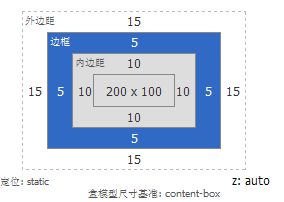 Next I need everyone to look at another effect — this point is quite critical, look carefully, on the same parameter basis, add one thing: the element itself sets its font size to: 14px;. You might say it’s very simple — just calculate it with the earlier formula and add it. So now let me add it as you said:
#wrapper { font-size: 0.875em;/\*1 ÷ 16 × 14= 0.875em value\*/ width: 12.5em;/\*1 ÷ 16 × 200 = 12.5em value\*/ height: 6.25em;/\*1 ÷ 16 × 100 = 6.25em value\*/ border: 0.3125em solid red;/\*1 ÷ 16 × 5 = 0.3125em value\*/ margin: 0.9375em;/\*1 ÷ 16 × 15 = 0.9375em value\*/ padding: 0.625em;/\*1 ÷ 16 × 10 = 0.625em value\*/ line-height: 1.125em;/\*1 ÷ 16 × 18 = 1.125em value\*/ }Now let’s look at the layout values calculated under firebug
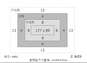 To explain the problem better, here are the values firebug calculates for the element with no font size set on itself versus the element with a font size set on itself:
 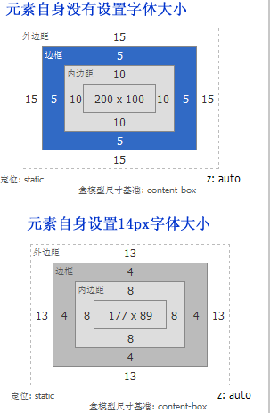 The main purpose of taking these screenshots is to illustrate one thing: once the element itself has a font size set, its calculation formula is no longer the one described earlier — we need to modify it: 1. The font calculation formula stays the same 1 ÷ the parent element’s font-size × the pixel value to convert = em value 2. The calculation formula for the other properties needs to become 1 ÷ the element’s font-size × the pixel value to convert = em value So now let’s calculate once more:
#wrapper { font-size: 0.875em;/\*1 ÷ 16 × 14= 0.875em value\*/ width: 14.2857em;/\*1 ÷ 14 × 200 = 14.2857em value\*/ height: 7.1429em;/\*1 ÷ 14 × 100 = 7.1429em value\*/ border: 0.357em solid red;/\*1 ÷ 14 × 5 = 0.357em value\*/ margin: 1.071em;/\*1 ÷ 14 × 15 = 1.071em value\*/ padding: 0.714em;/\*1 ÷ 14 × 10 = 0.714em value\*/ line-height: 1.2857em;/\*1 ÷ 14 × 18 = 1.2857em value\*/ }Let’s look at the calculated values once more:
Summary
After this long introduction, the only things I want to tell everyone are the following 1. The browser’s default font size is 16px 2. If the element itself has no font size set, then all of the element’s own property values such as “boder, width, height, padding, margin, line-height” can be calculated with the formula below 1 ÷ the parent element’s font-size × the pixel value to convert = em value 3. This one must be understood slowly, otherwise it is very easy to confuse it with point 2. If the element has a font size set, then the conversion of the font size still follows the second formula, that is, the one below: 1 ÷ the parent element’s font-size × the pixel value to convert = em value Then, for an element that has a font size set, the element’s other properties, such as “border, width, height, padding, margin, line-height”, need to be calculated with the formula below: 1 ÷ the element’s own font-size × the pixel value to convert = em value Put this way, I don’t know whether everyone has understood it clearly; if not, you can go back and look at one of the examples above.
Further reading
If everyone still doesn’t quite understand what I’m saying, you can click through to the related blog posts below:
- W3C‘s 《The amazing em unit》
- typophile.com‘s 《The Em》
- Webtypography‘s 《The Elements of Typographic Style Applied to the Web》
- Font-size in CSS2
- CSS2: Assigning property values, Cascading, and Inheritance
- Mike Cherim‘s 《CSS Layouts: The Fixed. The Fluid. The Elastic》
- Roger Johansson‘s 《Fixed or fluid width? Elastic!》
- Patrick Griffiths‘s 《Elastic Design》
Finally, as we finish this tutorial, let’s all thank Jon 陳 for bringing us such a great tutorial, 《The Incredible Em & Elastic Layouts with CSS》. If you need to repost this, please indicate the source: W3CPLUS
🧑💻 本文作者:艾瑞可erik
🔗 本文链接:https://erik.xyz/2015/05/20/css-zhong-qiang-da-de-em-en/
📜 版权声明:本作品采用 知识共享署名-非商业性使用-相同方式共享 4.0 国际许可协议 进行许可,转载请注明出处! 💙 支付宝
💙 支付宝 💚 微信
💚 微信